Brand refresh for Lucia Dulce
The brand refresh has given Lucia Dulce a modern and premium presence that aligns with its commitment to quality.
“Our new store design, packaging, and website have given us a more premium and cohesive look. We have seen increased foot traffic, stronger brand recognition, and a boost in revenue.”
Lucy Garay
Lucia Dulce
Background
Lucia Dulce’s branding felt outdated, and the store design did not reflect the premium quality that Lucia Dulce is known for.
There was also a lack of brand cohesion, with inconsistencies in signage, packaging, and marketing materials. This led to a fragmented brand presence that made it difficult to establish a strong identity. Additionally, the store interiors lacked warmth and functionality, which affected the overall shopping experience.
Design Conceptualization
The new brand direction focused on simplicity, consistency, and elegance. The goal was to create a modern yet inviting aesthetic that resonated with both loyal customers and new audiences. Natural wood elements, warm lighting, and greenery were introduced to give the stores a cozy yet sophisticated ambiance.
The branding was refined to ensure consistency across all touchpoints, from the store signage to product packaging. A fresh, minimalist approach was taken for packaging, balancing premium quality with an accessible and friendly feel. The store layout was redesigned to enhance customer flow, making it easier for visitors to explore the offerings and enjoy their experience.
Results & Impact
The brand refresh has given Lucia Dulce a modern and premium presence that aligns with its commitment to quality. The refined identity has strengthened brand recognition, making it more memorable in the market.
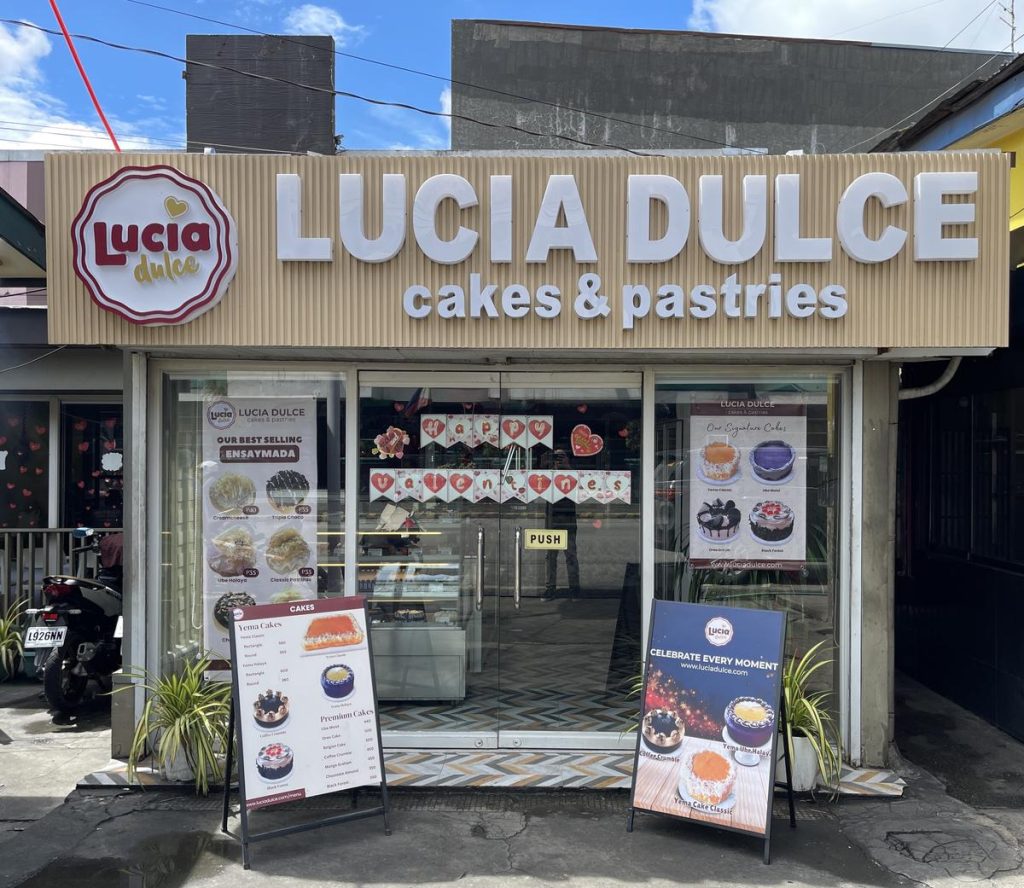
Lucia Dulce Branding Analysis (Before the Refresh)
- Storefront color scheme
- The brown, purple, and yellow color palette feels dated and does not evoke a premium bakery experience.
- Signage & Branding
- The logo signage is present but lacks emphasis due to the surrounding colors and placement.
- The store name does not stand out enough, making brand recognition weaker from a distance.
- Interior Design
- The flooring has a bold geometric pattern that may not align with a cozy, premium bakery aesthetic.
- The space lacks warmth and a clear, cohesive design direction.
- Decorations (such as the large cake mural) feel excessive and take attention away from the baked goods.
- Black pendant lights are a nice contrast but would work better in a more modern setting.
- Cake Box Design:
- The brown kraft-paper look is great for an eco-friendly feel, but the design lacks a premium appeal.
- The typography is a bit outdated and could use a modernized font with better hierarchy.
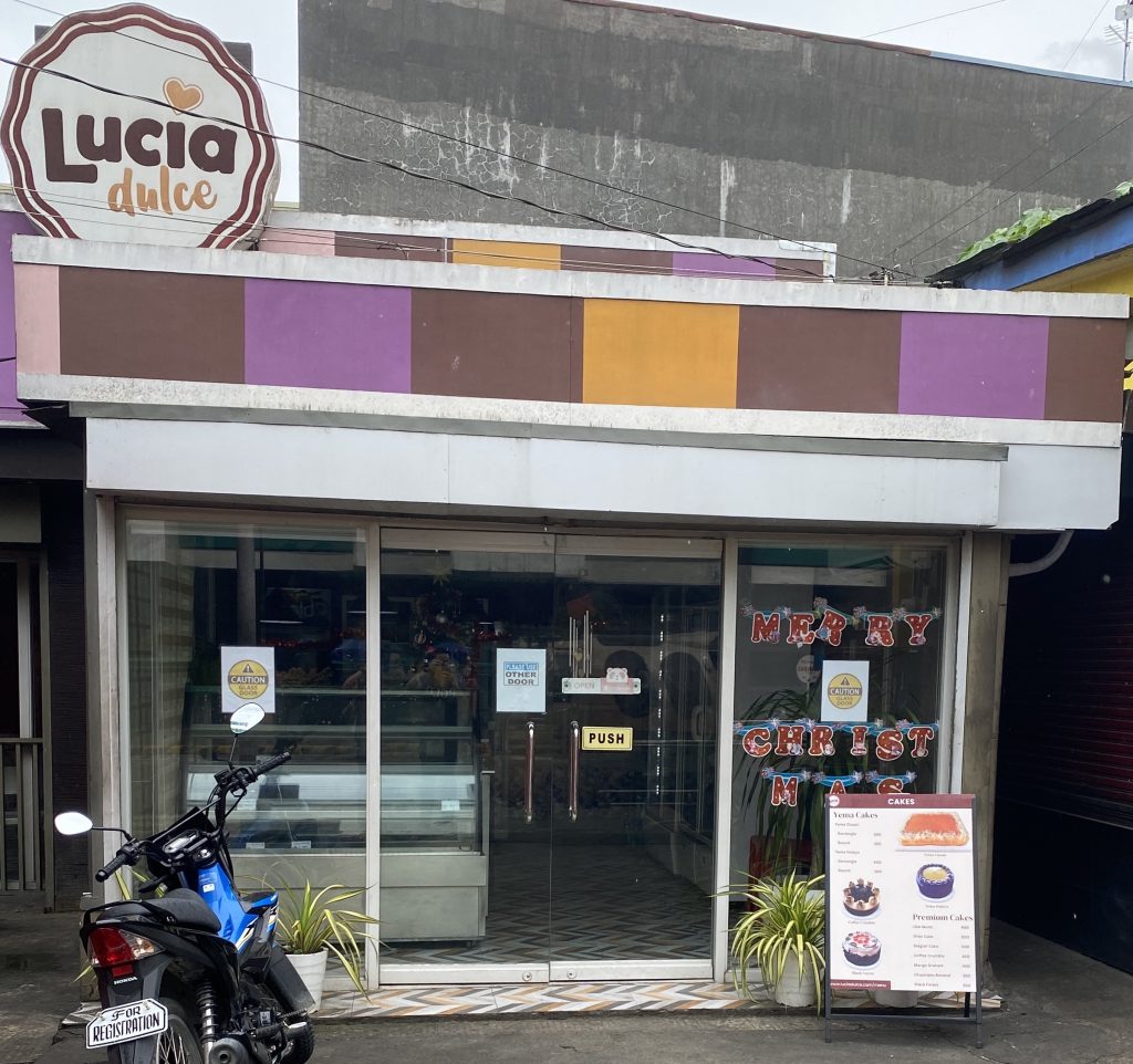
Storefront color scheme. The brown, purple, and yellow color palette feels dated and does not evoke a premium bakery experience.
Signage and branding. The store name does not stand out enough, making brand recognition weaker from a distance.
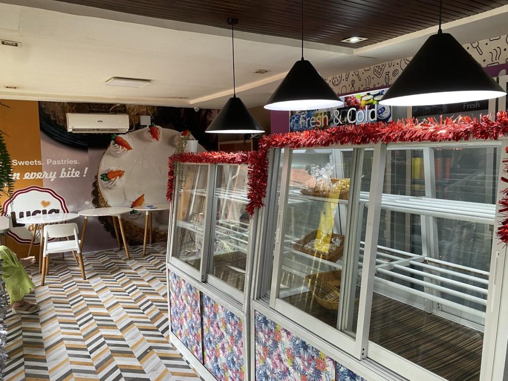
Interior design. The flooring has a bold geometric pattern that may not align with a cozy, premium bakery aesthetic. The space lacks warmth and a clear, cohesive design direction.
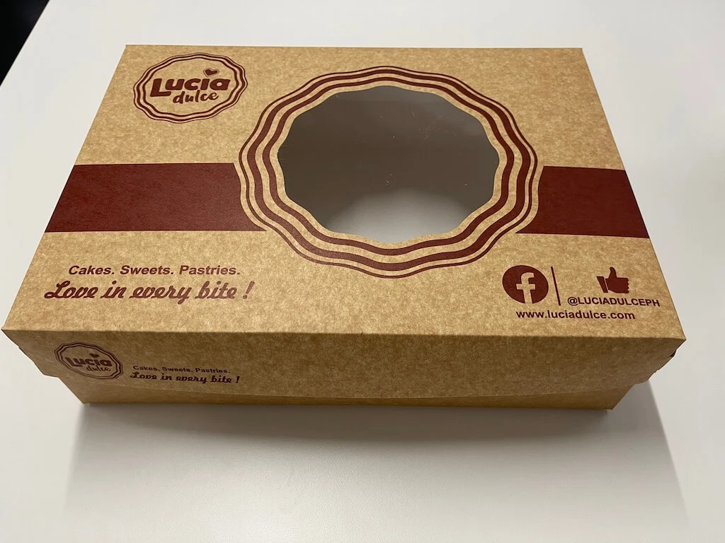
Cake box design. The brown kraft-paper look is great for an eco-friendly feel, but the design lacks a premium appeal. The typography is a bit outdated and could use a modernized font with better hierarchy.
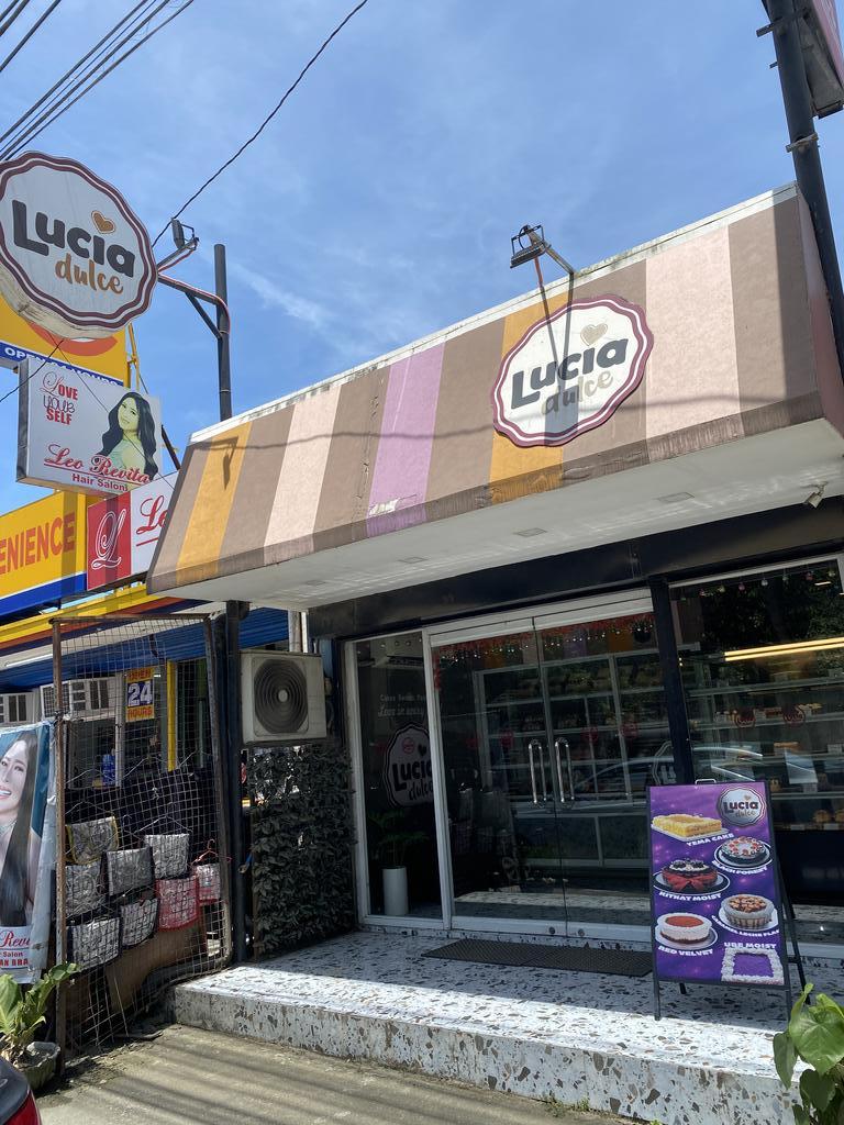
Lucia Dulce (After Brand Refresh)
At Rebrand Pro, we believe that a brand’s identity is more than just a logo—it’s an experience. When Lucia Dulce approached us for a brand refresh, our goal was to elevate their visual identity while staying true to their heritage of warmth, celebration, and premium at a quality price quality.
A Fresh Look for a Timeless Brand
We took a holistic approach to transforming Lucia Dulce, ensuring that every touchpoint reflects a modern, inviting, and premium bakery experience. Here’s how we brought their vision to life:
✔ Sophisticated Storefronts – We designed a wood-accented facade with bold, illuminated signage to create a striking yet welcoming exterior. This ensures Lucia Dulce stands out while maintaining an approachable charm.
✔ Elegant Interiors – Through warm lighting, natural textures, and thoughtful spatial planning, we transformed the store’s interior into a place where customers feel comfortable and inspired.
✔ Refreshed Packaging – We developed a modern, minimalist aesthetic for cake boxes, bread bags, and product labels. The updated branding now conveys quality, craftsmanship, and celebration. Our new tagline, “Celebrate Every Moment,” reinforces the emotional connection between Lucia Dulce and its customers.
Why the Refresh?
Lucia Dulce needed a refresh that would modernize their brand without losing their essence. Our goal was to create:
✔ A Stronger Emotional Connection – The new branding reflects the joy, comfort, and celebration that define Lucia Dulce’s products.
✔ Brand Consistency – Every customer touchpoint, from storefront to packaging and digital presence, now tells the same premium, cohesive story.
✔ An Enhanced Shopping Experience – We improved in-store navigation, visual merchandising, and ambiance to ensure an enjoyable and seamless customer journey.
Signage. A wood-accented facade with bold, illuminated signage to create a striking yet welcoming exterior. This ensures Lucia Dulce stands out while maintaining an approachable charm.
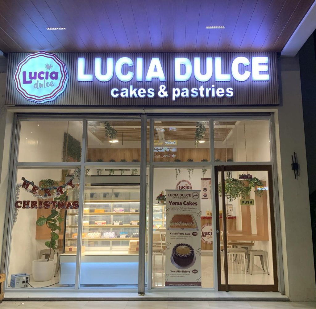
Storefront. The new store exudes a modern, elegant, and inviting ambiance. The wooden slat texture and bold, illuminated signage create a sophisticated and premium look.
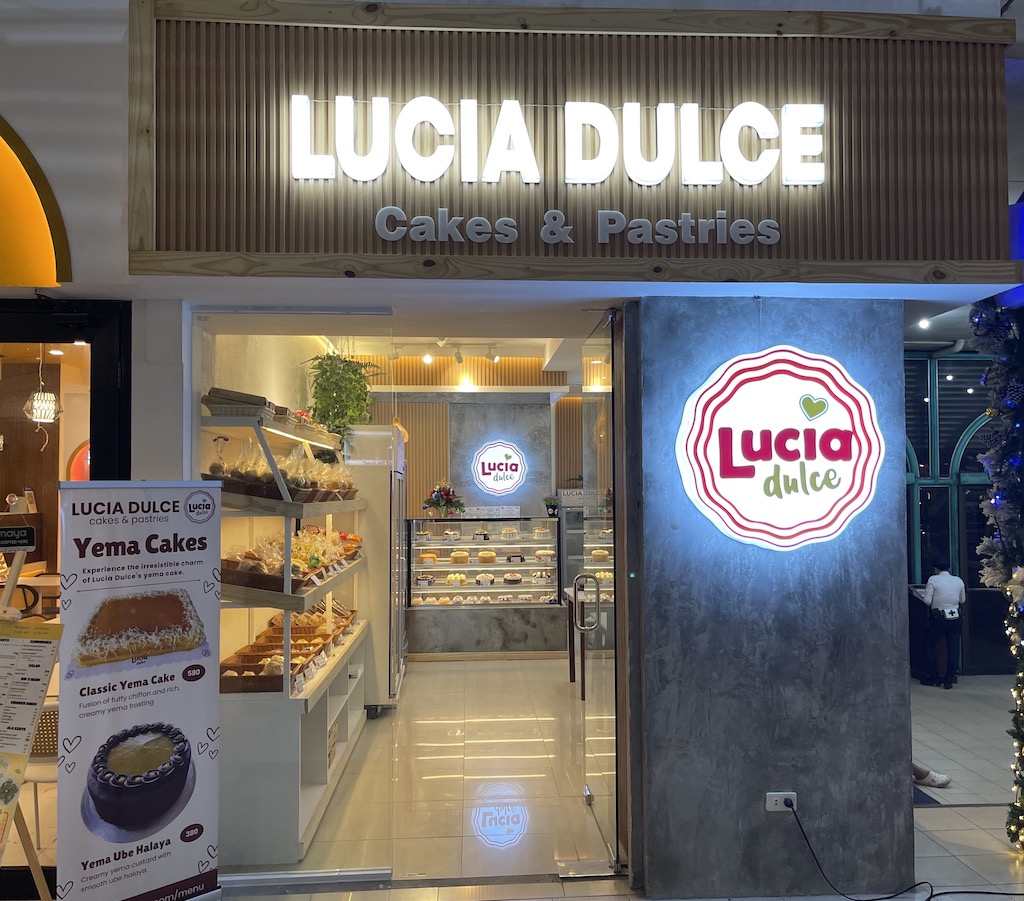
Lighting. The LED-lit signage and warm interior lighting enhance the customer experience, making the store appear high-end.
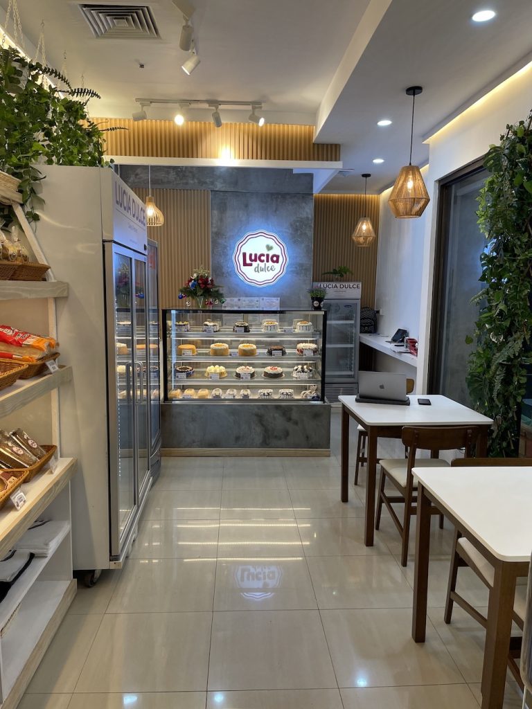
Interior details. The use of greenery, neutral tones, and natural textures (wood & concrete) brings warmth while maintaining a clean, modern aesthetic.
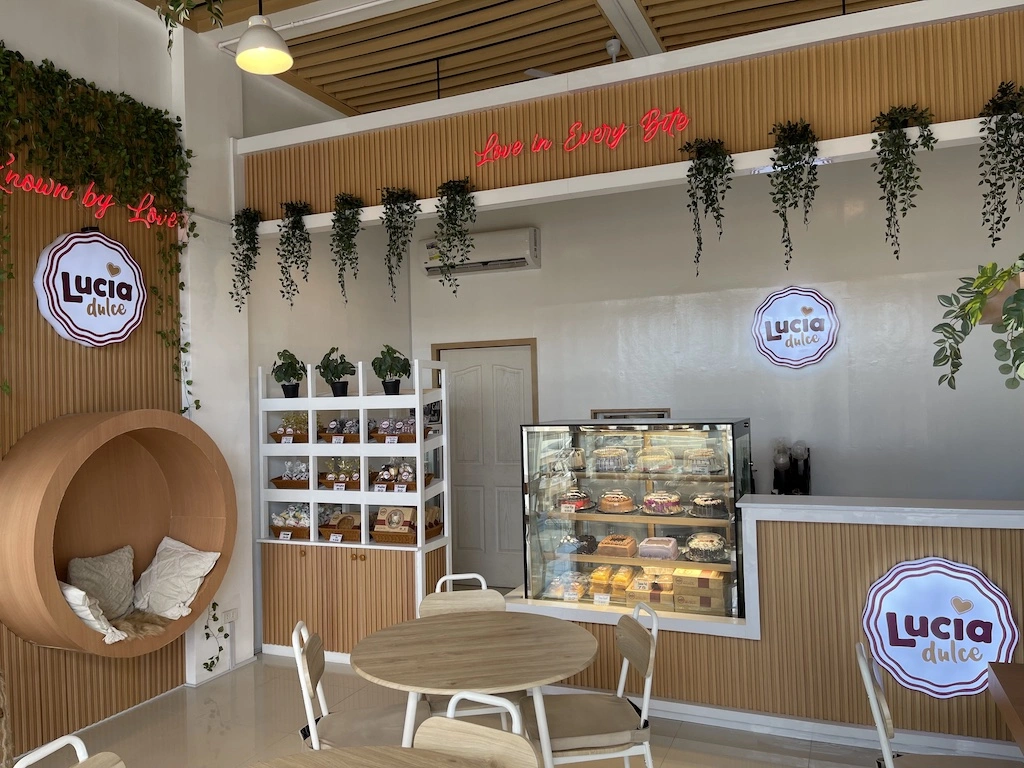
Natural wood accents. The use of wood paneling on the counter, shelves, and ceiling elements adds warmth and a premium touch. This creates a cozy yet sophisticated ambiance that elevates the brand identity.
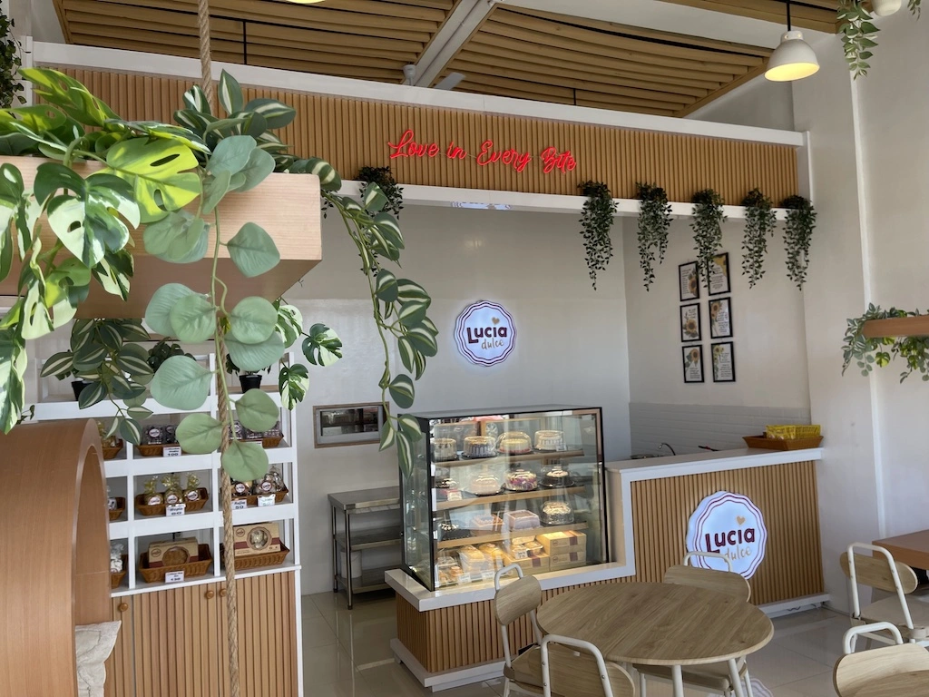
Neutral tones. The surrounding neutral tones keep the focus on the baked goods while reinforcing a clean and modern aesthetic.
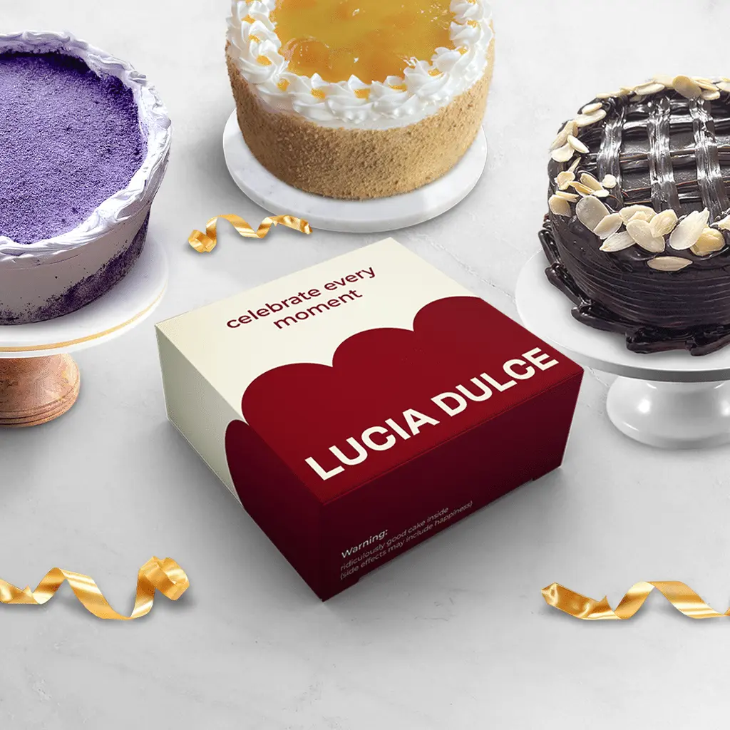
New tagline on premium cake box design. “Celebrate Every Moment” – a stronger emotional connection.
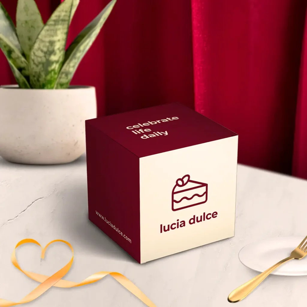
Petite cake box design. Elegant maroon-and-cream packaging with minimalist design.
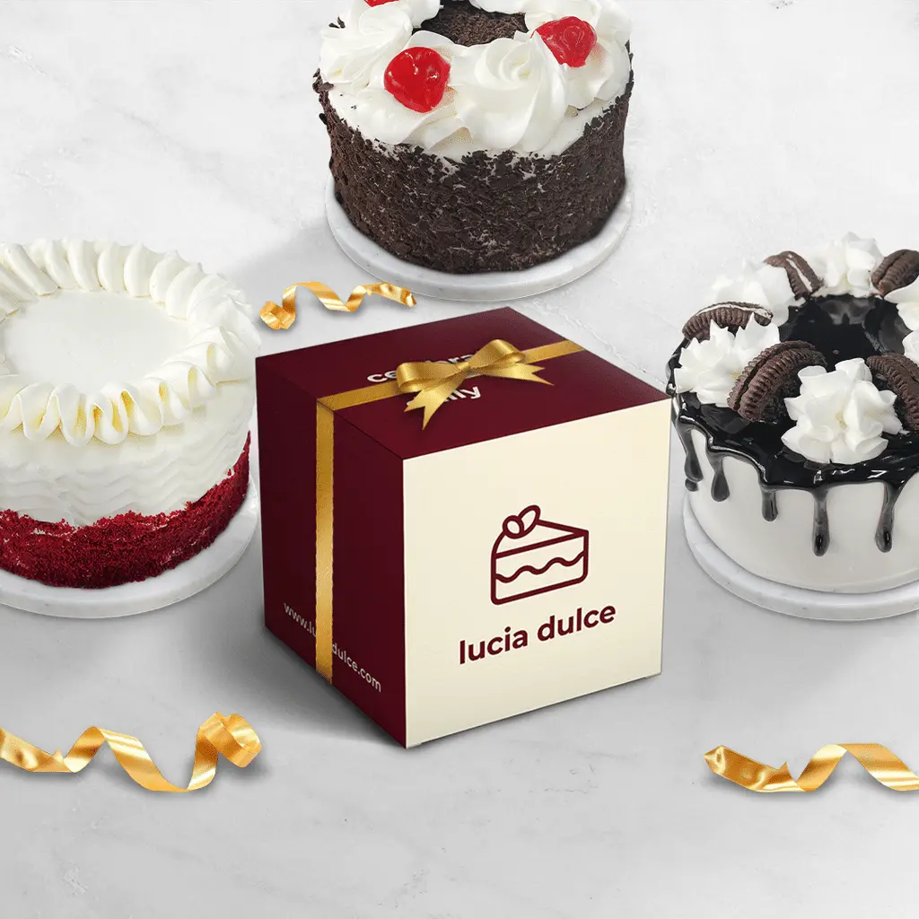
Strong brand presence with iconic simplicity. Playful icon and clean “lucia dulce” typography.
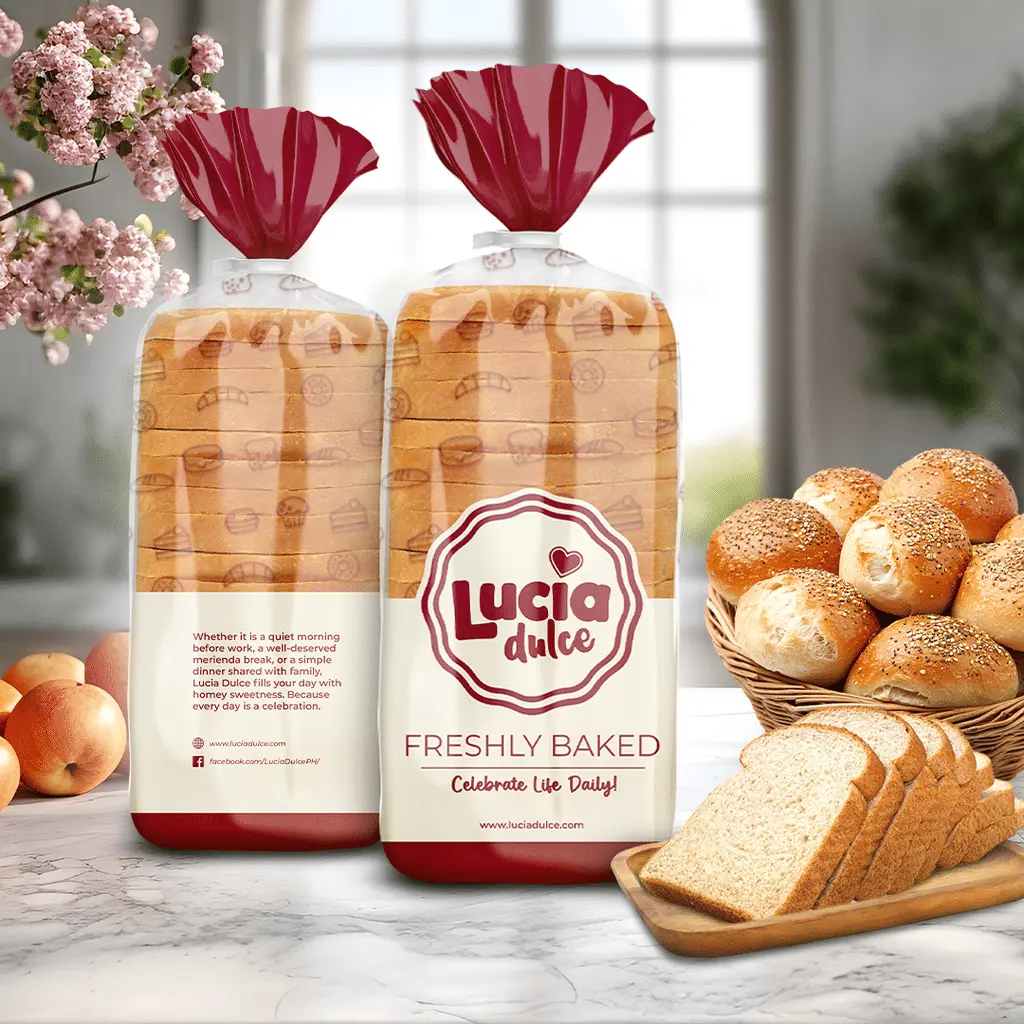
Brand consistency. The bread packaging features Lucia Dulce’s signature maroon and cream color scheme, ensuring strong brand recognition.
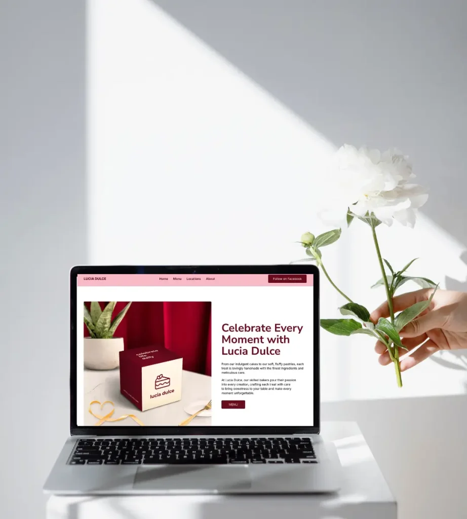
New website. Launched new website www.luciadulce.com following Rebrand Pro’s philosophy of simplicity, clarity, results-driven aesthetics, and timeless appeal.
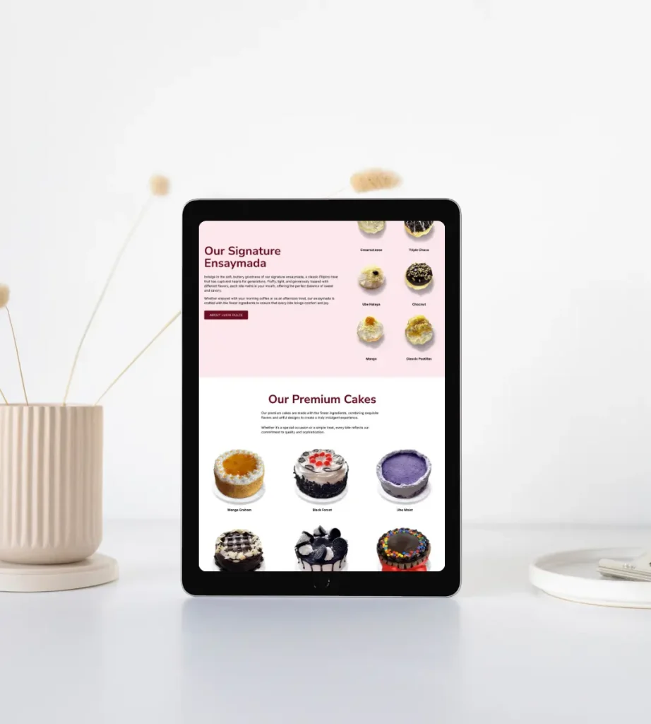
Optimized for tablets and mobile. It is also optimized for speed and search engines.